






The beverage aisle used to be predictable. Carbonated on the left, water on the right, and sugar everywhere in between. From protein-infused water to gust-boosting tonics, wellness has crept into the cold case and built its own lane.
What’s driving it isn’t just marketing, it’s behavior. Shoppers aren’t looking for just flavor or fizz. They want function, ingredients they recognize, and claims that hold up under scrutiny. That shift is forcing brands to rethink not just what’s inside the bottle but how it lands on the shelf.
Health Has Become the Baseline
You don’t need a health label to expect function in your drink anymore. Wellness drinks have quietly become the default option across fridges and coolers. Whether someone is grabbing sparkling water or post-workout protein, they expect something beyond flavor: hydration, energy, recovery, or gut support.
That change didn’t happen because brands decided to clean up their act. Consumers got smarter. They started reading ingredient panels and picking drinks with clear benefits. Words like electrolyte, probiotic, and adaptogen moved from fitness feeds to lunch breaks. Now, a “zero sugar” label speaks to performance as much as wellness. NielsenIQ reports that functional beverages account for approximately 10% of the U.S. non-alcoholic category and have grown 54% between March 2020 and March 2024.
Grand View Research estimates U.S. functional drink revenue at $48.5 billion in 2024 and anticipates it will reach nearly $78 billion by 2030. That’s a compound annual growth rate of 8.3%! Even legacy CPG giants are feeling the shift. Coca-Cola invested in BodyArmor. PepsiCo tweaked Rockstar. These moves aren’t about trend chasing, but about relevance. The brands that win today solve a problem in real life.
Case Study: Liquid I.V. Made Hydration Functional and Visible
Liquid I.V. didn’t try to blend in. It stood out by naming the problem and solving it clearly. Where most hydration products relied on sporty branding or vague benefits, Liquid I.V. went clinical. The formula is based on cellular transport technology, a concept pulled from hospital-grade rehydration treatments. Instead of keeping that science in the fine print, the brand made it the headline.
The packaging helps. A single stick looks clean, medical, and easy to understand. The name says what it does. The icons reinforce it. You’re not guessing whether it hydrates or wondering when to drink it. The use case is right on the packet: post-workout, travel, hangover, flu, jet lag.
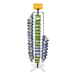
That clarity translated well at retail. Liquid I.V. rarely hides in a sea of wellness SKUs. It claims space near pharmacy aisles and point-of-sale displays, not just the beverage cooler. At big-box stores, you’ll find it on endcaps and power wings where the packets can sit upright, cleanly branded, next to signage that reinforces the functional payoff. It’s the opposite of cluttered. That minimalism, paired with real functional benefit, makes the category easier to shop.
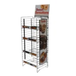
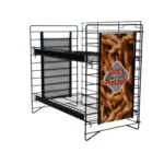
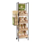
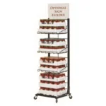
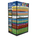
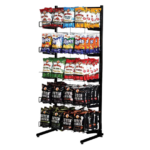
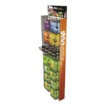
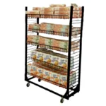
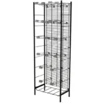
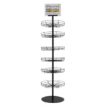
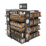
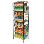
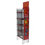
The brand didn’t stop at packaging. Their field strategy is tight. They’ve invested heavily in in-store display units that are lightweight, colorful, and built for both replenishment and self-selection. The product stays front-facing, and the shelf presence stays clean, which makes restocking easier and shrinkage less likely. Retailers like that kind of predictability.

Ingredients: As a New Display Opportunity
As ingredient panels get shorter, the shopper’s expectations get higher. Labels like “adaptogens,” “electrolytes,” and “nootropics” are showing up across wellness drinks, but not everyone knows what they mean. Displays offer a chance to fill that gap. When brands use simple language and visual guides near the product, they help shoppers make faster, more confident decisions. Showing the why behind the product helps it stick in consumers’ minds. Smart messaging placement can become as important as the beverage itself.
Shelf Space Demands Smarter Displays
Walk into a cooler and it’s a jumble of bottles, cans, bars, and powders. That’s complexity, and complexity drives indecision. With more options and more choices comes more pressure to stand out.
The brands winning in this space aren’t adding noise. They’re adding clarity. You can see it in the way they design their displays: bold headers, focused colors, clean lines. They simplify decision-making without dumbing it down. The shopper doesn’t need to guess whether it’s for hydration, energy, or recovery. The visual cues say it faster than a label ever could.
Retailers are also rethinking placement. When wellness drinks are grouped by function, not just brand, customers don’t bounce between aisles or stare blankly at a wall of SKUs. They move with purpose. And when displays are easy to stock and stay looking sharp, that performance continues across the week, not just on delivery day.
That’s where thoughtful execution makes a real difference. Display partners who understand shopper behavior and logistical constraints can create systems to showcase products that are not just attractive and informative, but also repeatable. When a display is easy to use, store teams are more likely to keep it looking its best.

Final Thought
Health-conscious drinks have reshaped what shoppers expect from the beverage aisle. What was once niche is now mainstream, and the pressure to perform isn’t just on the product, but also on how it’s presented.
Smart display meets real demand. That is where the opportunity is.